Calculate 15N PREs with cross-correlation effects
This example shows how to PREs for 15N in the presence of CSA-Curie spin cross-correlation effects. \({\Delta\chi}\)-tensors are used from a previous PCS fitting.
Downloads
Download the data files
4icbH_mut.pdb,calbindin_Tb_N_R1_600.preandcalbindin_Tb_HN_PCS_tensor.txtfrom here:Download the script
pre_calc_nitrogen.py
Script + Explanation
First the relevant modules are loaded, the protein and data are read and the data is parsed by the protein.
from paramagpy import protein, metal, dataparse

# Load the PDB file
prot = protein.load_pdb('../data_files/4icbH_mut.pdb')

# Load PRE data
rawData = dataparse.read_pre('../data_files/calbindin_Tb_N_R1_600.pre')

# Parse PRE data
data = prot.parse(rawData)
The Tb tensor fitted from PCS data is loaded and the relevant parameters, in this case the magnetic field strength, temperature and rotational correlation time are set.
met = metal.load_tensor('../data_files/calbindin_Tb_HN_PCS_tensor.txt')
met.B0 = 14.1
met.T = 298.0
met.taur = 4.25E-9
A loop is conducted over the nitrogen atoms that are present in the experimental data. The PRE is calculated using the function paramagpy.metal.atom_pre(). Calculations without CSA are appended to the list cal and calculations including CSA cross-correlation with the Curie-spin relaxation are appended to the list cal_csa.
exp = []
cal = []
cal_csa = []
for atom, pre, err in data[['atm','exp','err']]:
	exp.append(pre)
	cal.append(met.atom_pre(atom, rtype='r1'))
	cal_csa.append(met.atom_pre(atom, rtype='r1', csa=atom.csa))
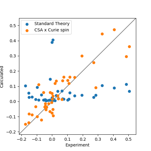
Finally the data are plotted. Clearly CSA cross-correlation is a big effect for backbone nitrogen atoms and should always be taken into account for Curie-spin calculations. Also note the existence and correct prediction of negative PREs!
from matplotlib import pyplot as plt
fig, ax = plt.subplots(figsize=(5,5))

# Plot the data
ax.scatter(exp, cal, label="Standard Theory")
ax.scatter(exp, cal_csa, label="CSA x Curie spin")

# Plot a diagonal
l, h = ax.get_xlim()
ax.plot([l,h],[l,h],'grey',zorder=0)
ax.set_xlim(l,h)
ax.set_ylim(l,h)

# Make axis labels and save figure
ax.set_xlabel("Experiment")
ax.set_ylabel("Calculated")
ax.legend()
fig.savefig("pre_calc_nitrogen.png")
Output: [pre_calc_nitrogen.png]